
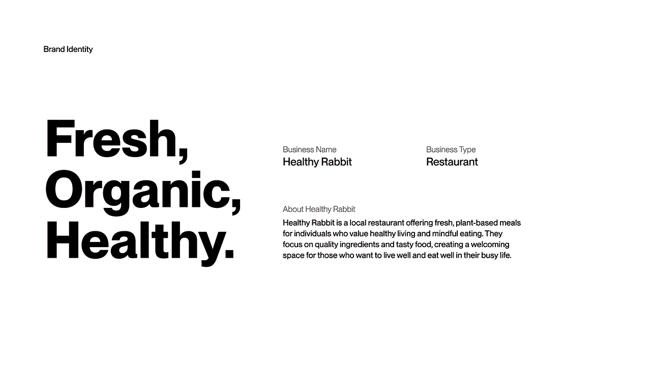
Healthy Rabbit
This project rebrands Healthy Rabbit to elevate its position as a premium, healthy dining destination while maintaining an approachable and fresh identity.
Sector
Scope
Brand Strategy, Research, Logo Design
Tool
Adobe illustrator, Figma
Timline
7 – 8 weeks
Context
Healthy Rabbit is a local restaurant established in 2015, known for offering fresh, healthy, and eco-conscious meals. While the business had built a loyal customer base, its visual identity no longer reflected the quality of its ingredients or its potential positioning within a competitive local market.
The existing brand felt approachable but lacked the clarity and refinement needed to communicate freshness, sustainability, and premium value.
Challenge
Redesign Healthy Rabbit’s brand identity to position it as the go-to destination for high-quality, healthy food.
The new identity needed to:
Reflect freshness and sustainability
Feel approachable yet premium
Stay aligned with existing brand values
Work across signage and marketing materials
Project Outcome
A refreshed logo and cohesive brand image that elevates Healthy Rabbit’s market position while staying true to its roots. The new identity balances warmth and refinement, creating a more modern and premium presence across touchpoints.
Market Research
Market Gap
The local market in Brantford has a significant gap for high-quality, healthy dining options. This presented a major opportunity for Healthy Rabbit to become the leading brand in this niche.
Visual Language
Successful healthy brands use simple imagery, bold fonts, and natural colours (like green, brown, and orange) to convey their values. Logos with too many decorative details or complicated styles often appear messy and unprofessional.
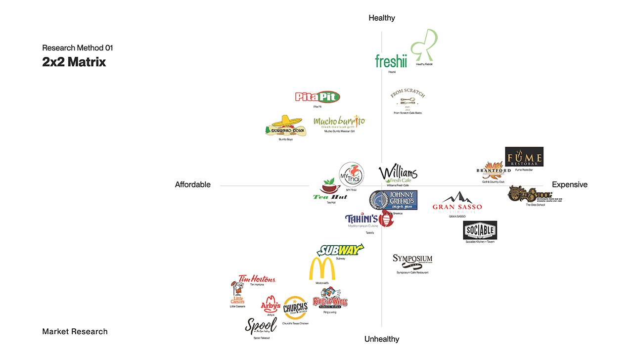
Competitive Analysis
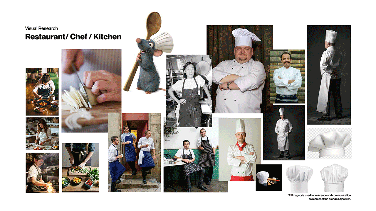
Design Process
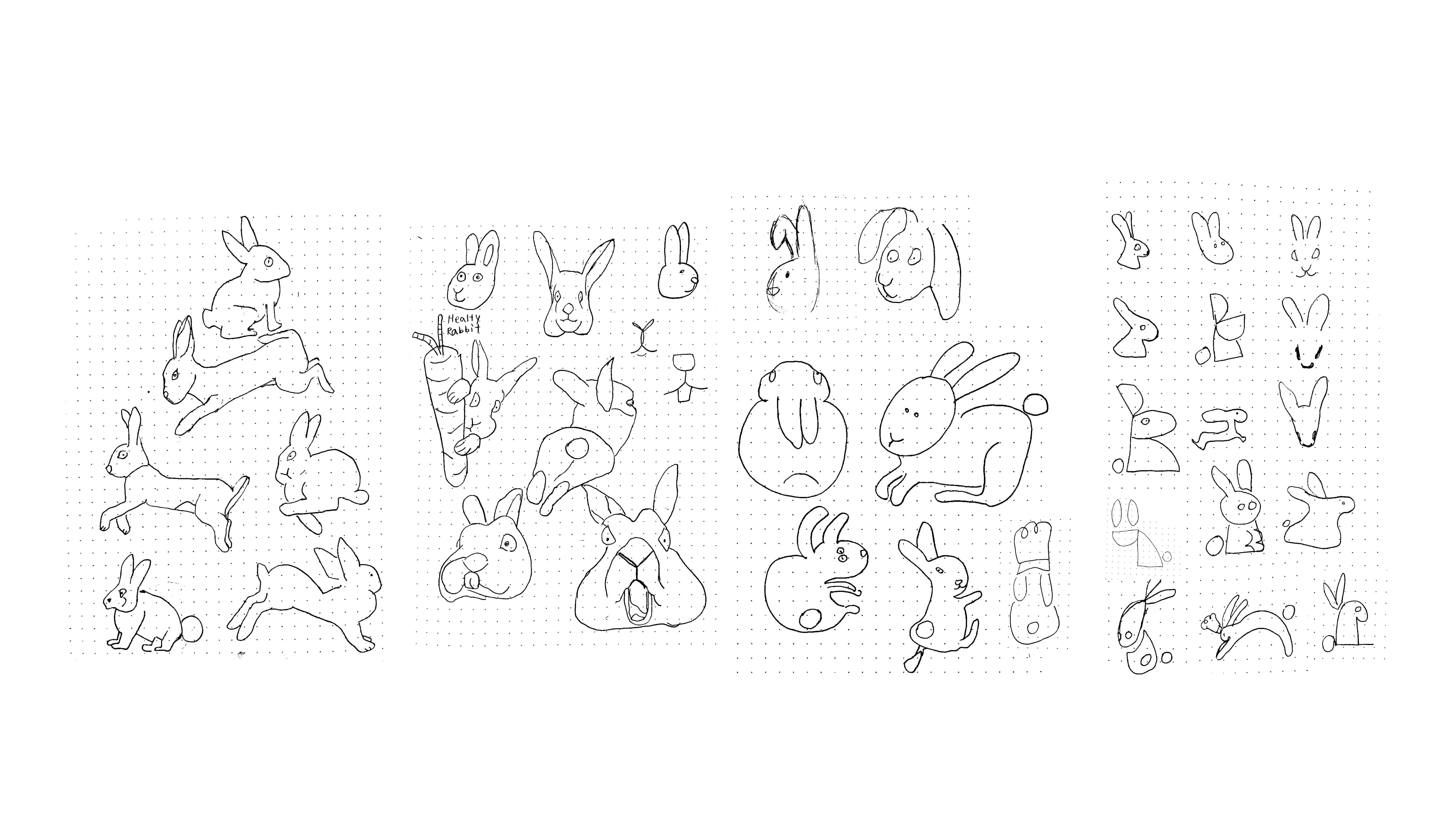
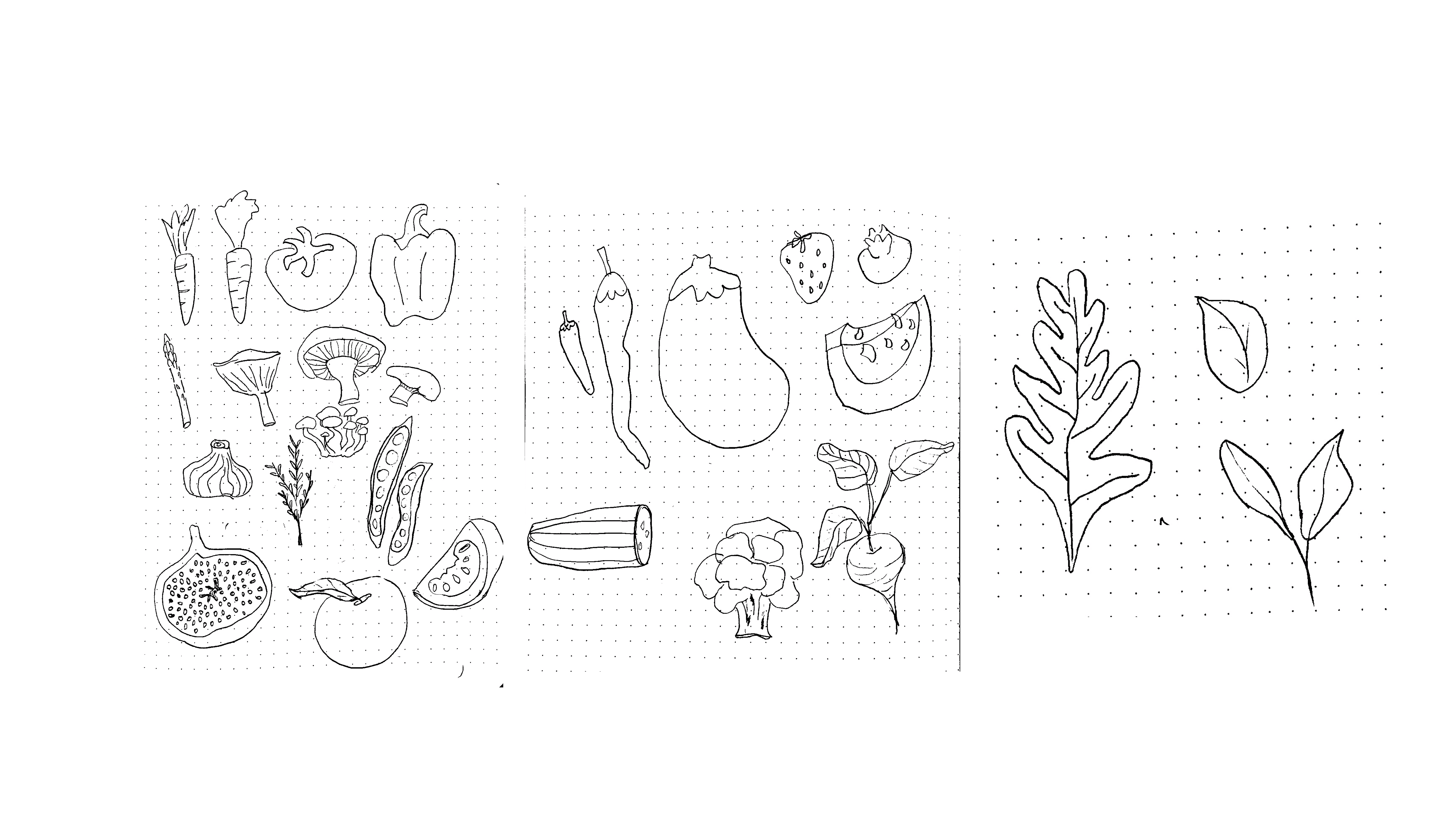
Ideation
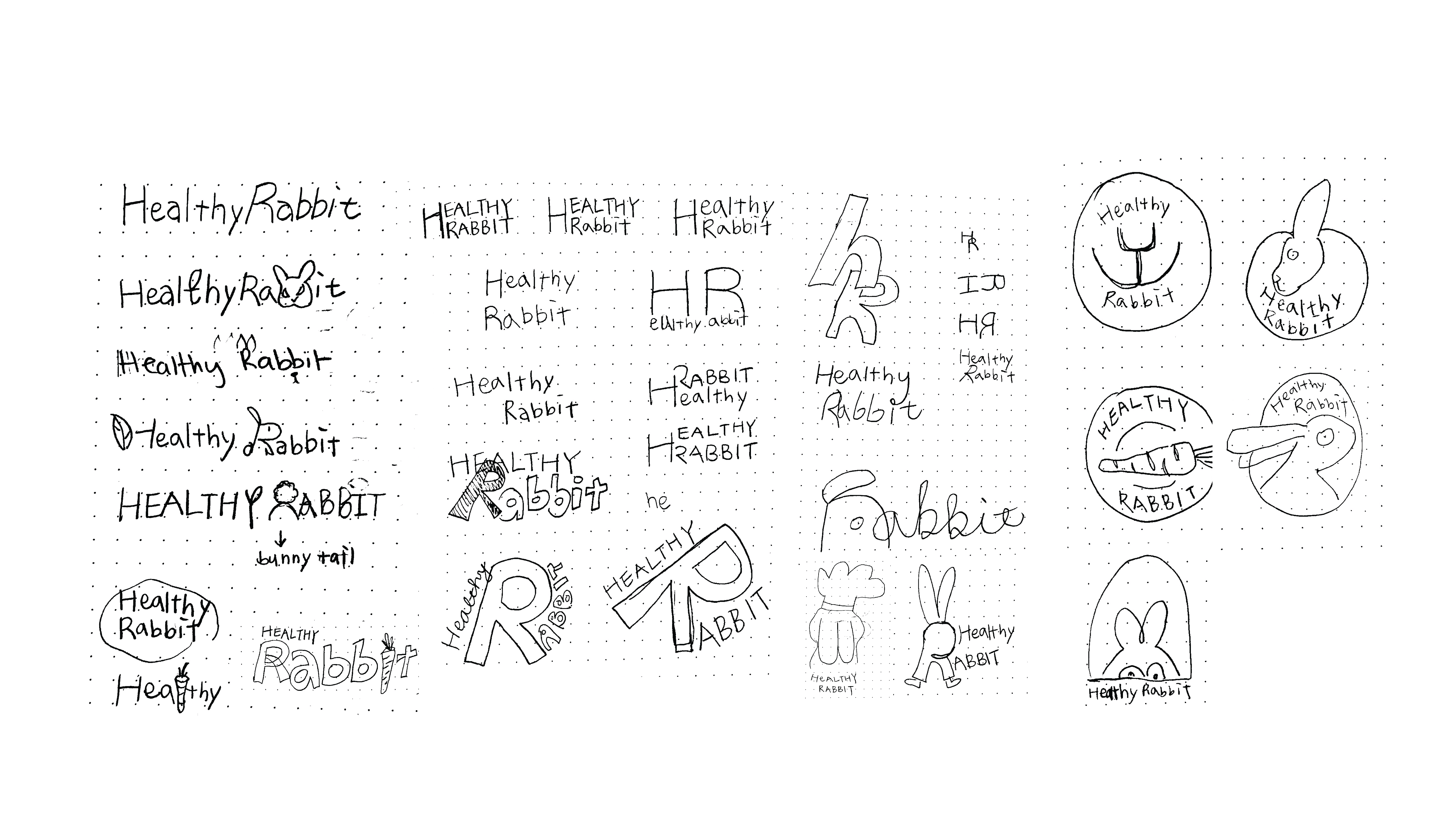
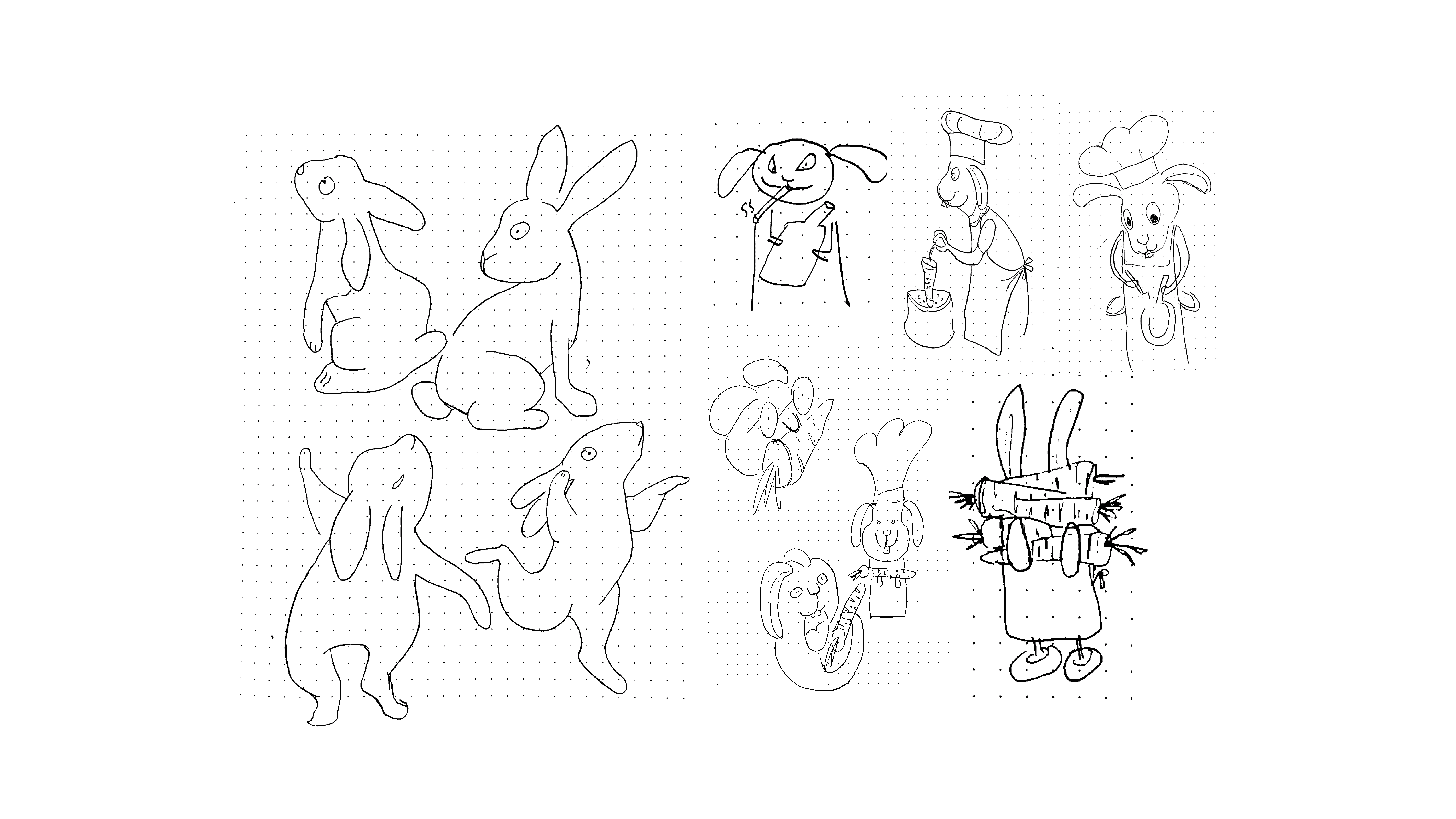
Iteration


(Final Solution)
|


